Fully responsive
Abschlussbedingungen
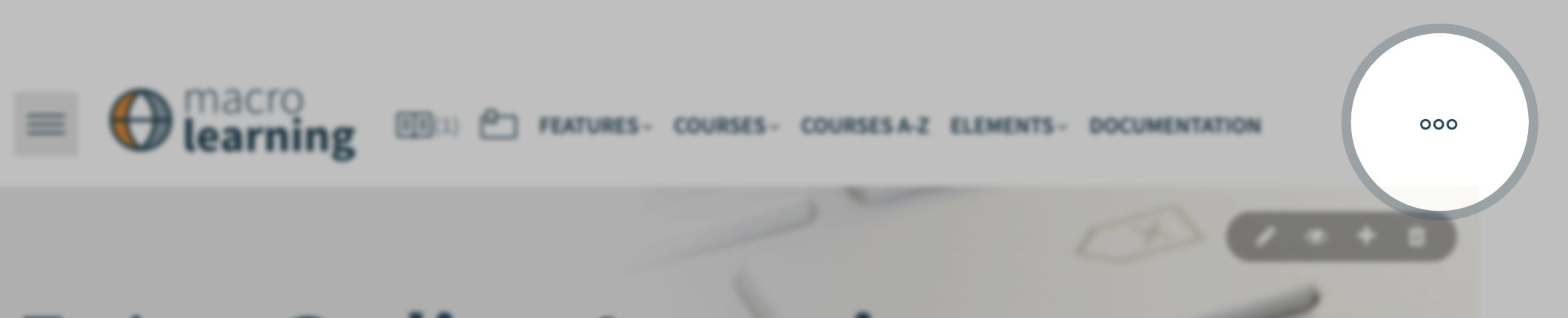
Macro Learning is a fully responsive theme. This means that theme not only provides two types of menu for desktop and smatphones but navigation, layout, header, slider, footer, etc. adapt to any screen size or device.
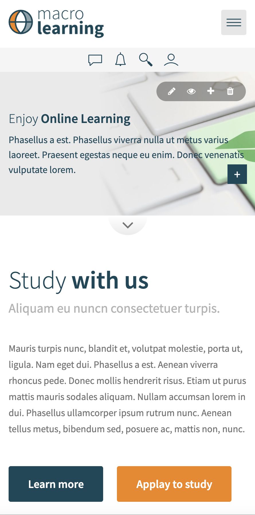

Especially theme header looks different on desktop, tablet and smartphone device. Try to resize the browser window to see how it works.